"Improve My Game" Jam 35
New Features!
NPCs
- Looped Movement
We've got a really nice solution here, where we can draw a simple Path2D and the NPC just follows it. I love how designable it is.
- Aggro
Aggro is implemented with a RayCast driven which direction the unit is facing. Simple line-of-sight aggro.
- Pathfinding
I decided to use NavigationAgent2D to lock in on an aggro target. I divided space into 4 possible vectors, and found the nearest "direction" to the actual vector of the current unit position to the next navigation-path position. This resulted in old-school 4-direction movement while reusing a more robust (in this case overly expensive and complex) underlying algorithm. It's one of those tradeoffs you take to try to get the thing done.
Zones
I worked out a reasonable compromise between "designability" and code-control for scenes. In our main scene, we have all doors and instances of child-scenes (zones). Doors have reference to the zones they lead between, and having it all in one place allows you to inspect the connection of the game world and how it all lines up at runtime.
Sprites
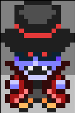
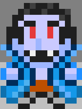
The original game was done for GBJam which limited us to 4 colors. This opened a _huge_ can of worms for us. We knew we needed to stick to a color palette, but establishing that palette was a really fun and distracting problem. We ended up getting a much deeper understanding of color theory and the use of color in classic pixel art games. I'm still not sure what the answer is here, either building the palette over time while you construct materials, or building it "in the abstract" up-front with a restricted but comprehension mix of hue, saturation and lightness. If you build a palette "a la carte" you may run the risk of quickly accumulating many similar colors and getting a less distinct and unified result. Probably a "higher" concern than where we're at now, but we like to dream.
Battle Transition: Experimenting with Godot Shaders
I experimented with Godot shaders long enough to get a "pixelize transition" into the game, driven by an AnimationPlayer.
Failed Experiment: Normal Maps
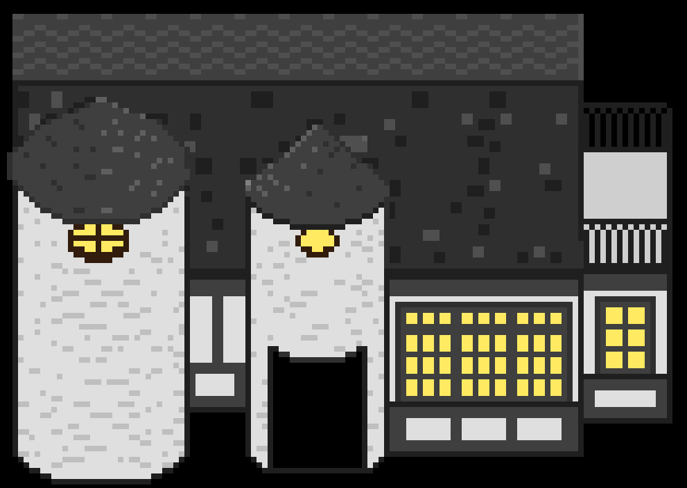
We added a normal map to the Shop building hoping to use some nice lighting to elevate the visuals, but it became clear that it wouldn't be worth it for us to make normal maps for all of our buildings just to get soft lighting in the game. Maybe for a longer term project, or a game with a different camera angle or 3D.
Files
Corporeal Combat
a legally distinct pokemon-inspired game
| Status | Prototype |
| Authors | leecommamichael, natelee |


Leave a comment
Log in with itch.io to leave a comment.